Blog /
Creating Custom Components in Framer: A Step-by-Step Tutorial
Creating Custom Components in Framer: A Step-by-Step Tutorial
Build Reusable Design Elements: A Framer Component Tutorial
Framer empowers designers with code-like flexibility in a visual interface, making interactive design seamless. Mastering custom components is key to streamlining workflows and enhancing creativity. This guide, "Creating Custom Components in Framer: A Step-by-Step Tutorial," walks you through building reusable design elements, from setup to interactivity. Whether you're developing a design system, speeding up prototyping, or adding unique interactions, this tutorial will help you unlock efficiency and creative control in your Framer projects.
Why Custom Components? Boosting Efficiency and Consistency
Before diving into the "how," let's address the "why." Custom components in Framer are reusable building blocks that significantly enhance your design workflow. Imagine creating a button, navigation bar, or interactive card once and then being able to use it across multiple projects, maintaining design consistency and saving countless hours. This section will explore the core benefits of using custom components. We'll discuss how they promote design system creation, improve project scalability, and accelerate prototyping by eliminating repetitive design tasks. Furthermore, custom components encourage a modular design approach, making your projects more organized, maintainable, and easier to update in the long run. Understanding these advantages will highlight why mastering custom components is a game-changer for any serious Framer user.
Step-by-Step: Building Your First Custom Component
Let's get practical! This section provides a step-by-step tutorial for creating your first custom component in Framer. We'll start with a simple example, such as creating a reusable button component. The tutorial will cover:
Creating a new component: Navigating the component panel in Framer and creating a new component frame.
Designing the component visually: Adding layers, styling, and creating the visual appearance of your button.
Setting up component structure: Organizing layers within the component for clarity and maintainability.
Testing your component: Dragging and dropping your new component onto the canvas and verifying its basic functionality.
This hands-on guide will provide you with a solid foundation for building more complex components in later sections.

Adding Properties and Controls: Making Components Flexible
Static components are useful, but properties and controls are what make them truly powerful and reusable. This section will teach you how to add custom properties to your components, allowing you to control their appearance and behavior directly from the properties panel. We'll cover:
Adding properties: Using the properties panel to add text properties, color properties, image properties, and more.
Connecting properties to layers: Linking component properties to layer styles and content, enabling dynamic adjustments.
Creating controls: Setting up different types of controls (text fields, color pickers, sliders, etc.) for easy property manipulation in the properties panel.
Example: Button Component with Text and Color Properties: We'll enhance our button component from Section 2 by adding properties to customize its text label and background color.
By adding properties and controls, you transform your components into flexible, customizable elements that can be adapted to various design contexts without needing to be rebuilt from scratch each time.
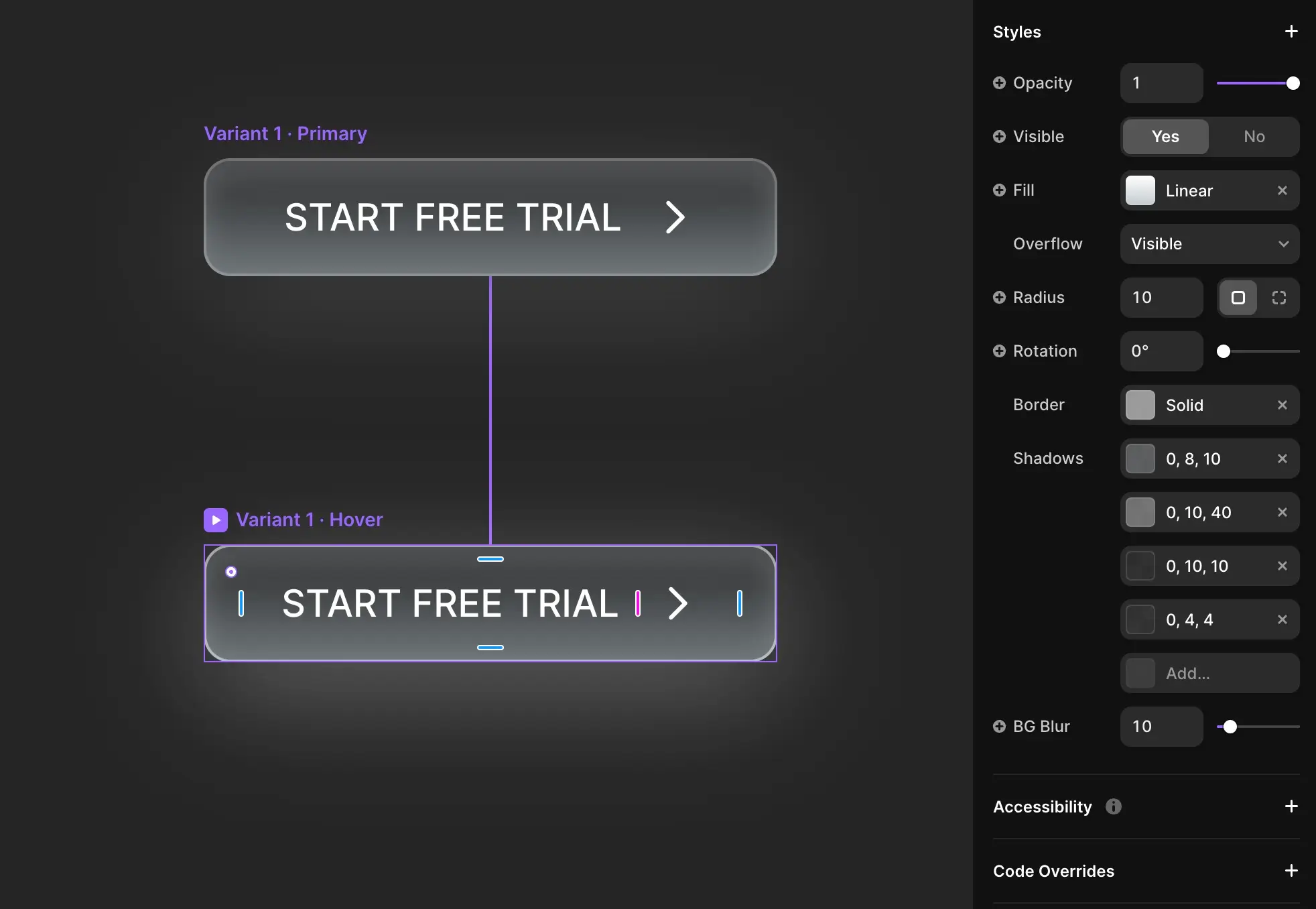
Interactivity with States and Events: Dynamic Component Behavior
o truly bring your components to life, you need to add interactivity. This section focuses on using states and events to define how your custom components respond to user interactions. We'll explore:
Defining states: Creating different visual states for your component (e.g., default, hover, pressed, active).
Adding transitions between states: Animating smoothly between different component states to provide visual feedback.
Using events: Triggering state changes based on user events like clicks, mouseovers, and more.
Example: Interactive Button Component: We'll further enhance our button component to include hover and pressed states with subtle animations, making it respond dynamically to user interactions.
Mastering states and events allows you to create interactive components that provide rich feedback and enhance the overall user experience of your Framer prototypes and designs.
Unlock Efficiency and Creativity with Custom Components
Creating custom components in Framer is a powerful technique that can dramatically improve your design workflow and the quality of your projects. By building reusable design elements, you not only save time and maintain consistency but also unlock new creative possibilities. This tutorial has provided a step-by-step introduction to component creation, covering everything from basic setup to advanced interactivity. Now it's your turn to start building your own component library and experience the benefits firsthand. Ready to take your Framer skills to the next level and create truly efficient and scalable designs? Contact us today for expert Framer training and consulting, and let us help you build exceptional interactive experiences.
Unlock the Full Power of Framer
Design, prototype, and publish stunning websites without code. Try Framer today and experience the future of web design.